


Image courtesy of Ed Nute Photography
New Work, New Website
While struggling through a tough winter of rain, crazy temperature swings and other challenges, I have managed to produce some new work. Constrained to my more compact “auxiliary” studio space, and self-constrained to the less cooperative medium of watercolor, I have found a long-lost stylistic freedom that is personally very exciting. Good thing too, as it would be much easier to hibernate and watch the Bruins while falling asleep with my corpulent cat, Jockemo.
Yes, I have a cat. One that thankfully thinks he’s a dog and thus spares me from the usual feline characteristics that I grew up despising. He doesn’t fetch, but he likes hockey, so…
And I retooled my website, pulling out the newer watercolors into their own page for better group viewing. Take a look and let me know what you think.
Peace.
Blue Sky, 8 x 10, watercolor on board, 2023

Richard Swann, on his 92 birthday
The Source
As some of you know, my dad passed away on October 10. It was an incredibly peaceful transition and I, along with my brother and step-mom, were blessed to be there as he left. Of course, this event has been first and foremost on my mind ever since, and since one of the greatest gifts he passed on to me was his love of the written word, I’d like to honor him with a few of my own.
Most of the bond between my father and myself are strictly personal and will remain so, only to be shared with my family, but on this soapbox, my blog, it is more than appropriate to tell the story of what he meant to me as an artist. Because, very humbly and quietly, as was his style, he passed on to me key ingredients to a life in the arts.
He taught me the importance of curiosity and the search for knowledge. I cannot remember my father without a book nearby. He loved history especially and right until the very end of his life was learning about new places and things. He subscribed to Archaeology Today and read the newspaper (yes, in print!) every day. He traveled extensively over the years and always brought back much more than souvenirs.
He imprinted in me the love of story that every artist holds dear. I have a copy of a paper he wrote in college about Moby Dick. Though he thoroughly absorbed all the literary nuances and symbolism of that great novel, the last paragraph of his paper raved about the adventurous tale that took place on the sea. It was clear that he held that quality - the ability to tell a thrilling tale - above all of Melville’s more esoteric gifts. One of his favorite childhood authors was Richard Halliburton and, in venturing into the countless used bookstores we visited over the years, if there was a copy of “The Royal Road To Romance” or any other large 1920-era Halliburton travelogue, he bought it and often read it to me at bedtime.
Long before I heard the phrase “Keep it simple, stupid,” I was well-versed in the concept. Dick Swann loved the elegance of minimal embellishment. Sometimes it was in deference to taste, sometimes function. In his favorite literature, it was best illustrated by Hemingway and the idea of “one clean sentence.” His most beloved American artist was Andrew Wyeth, who, to him, painted deep emotion into simple settings. Even in humor, his go-to joke was the “shortest poem in the world, entitled “Fleas” which went, simply, “Adam had’m”
One of the running, very mild, disagreements dad and I had over the years (besides the length of my hair) centered around the importance of craftsmanship. He claimed that there could be no great art without great craftsmanship. Hence his disdain of the Abstract Expressionists and reverence of Michelangelo. Yet he loved Michelangelo’s Rondanini Pieta, clearly not the maestro’s most technically executed work (in fact, his last piece, sculpted when he was very old and probably half-blind). It took me awhile, but I came to realize that when dad said “craftsmanship” he really meant “care.” He wanted a piece of art to look as if the artist took care in bringing it to life, not slapped together. Since I came to that realization, I try to keep it mind in my studio.

“Rick Swann” circa 1944, Bridgton, Maine
But, if I’m honest, the most important ingredient my father contributed to my artistic being was the understanding that it was a path he veered away from in order to raise a family. It was known in my family that dad had dreamed of being a writer. He wrote well - witty poems in birthday cards, even recipes, sparked with his wry sense of humor. He even tried, following heart surgery in the early 70’s, to craft an essay about it and have it published, but the effort withered, he recovered and went back to work at the bank. I think I carried a mild sadness with me into art school that my father didn’t fulfill that dream. Not that I think it crippled him in any way. The most common words I heard at his wake were “kind” and “generous” and I know he was completely comfortable in his sacrificing his artistic dreams for his love of family.
I had always suspected this, but it was confirmed last April at the opening of my show at the Flora T. Little Gallery in Bridgewater. It was the last show of mine that my dad attended before mobility issues got the better of him. He pulled me aside and told me, in simple, elegant terms how proud he was of how I had navigated my own path in the art world and figured out a way to balance it with, as he defined it “the real world.” He was happy I kept making art. That was the greatest compliment I’ve ever received.
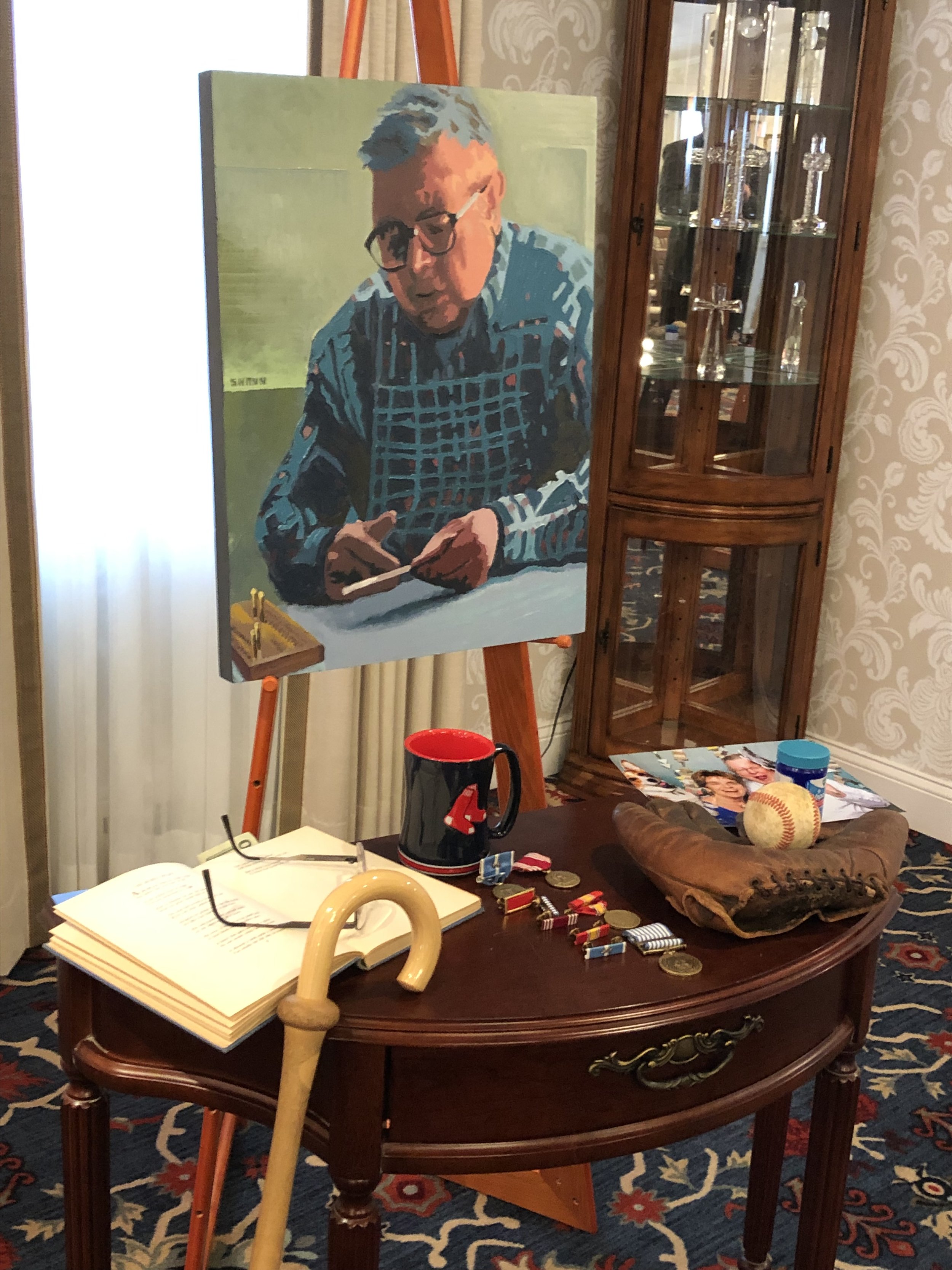
Memorial table at Dick Swann’s wake, October, 2022
Studio Annex, ETC.
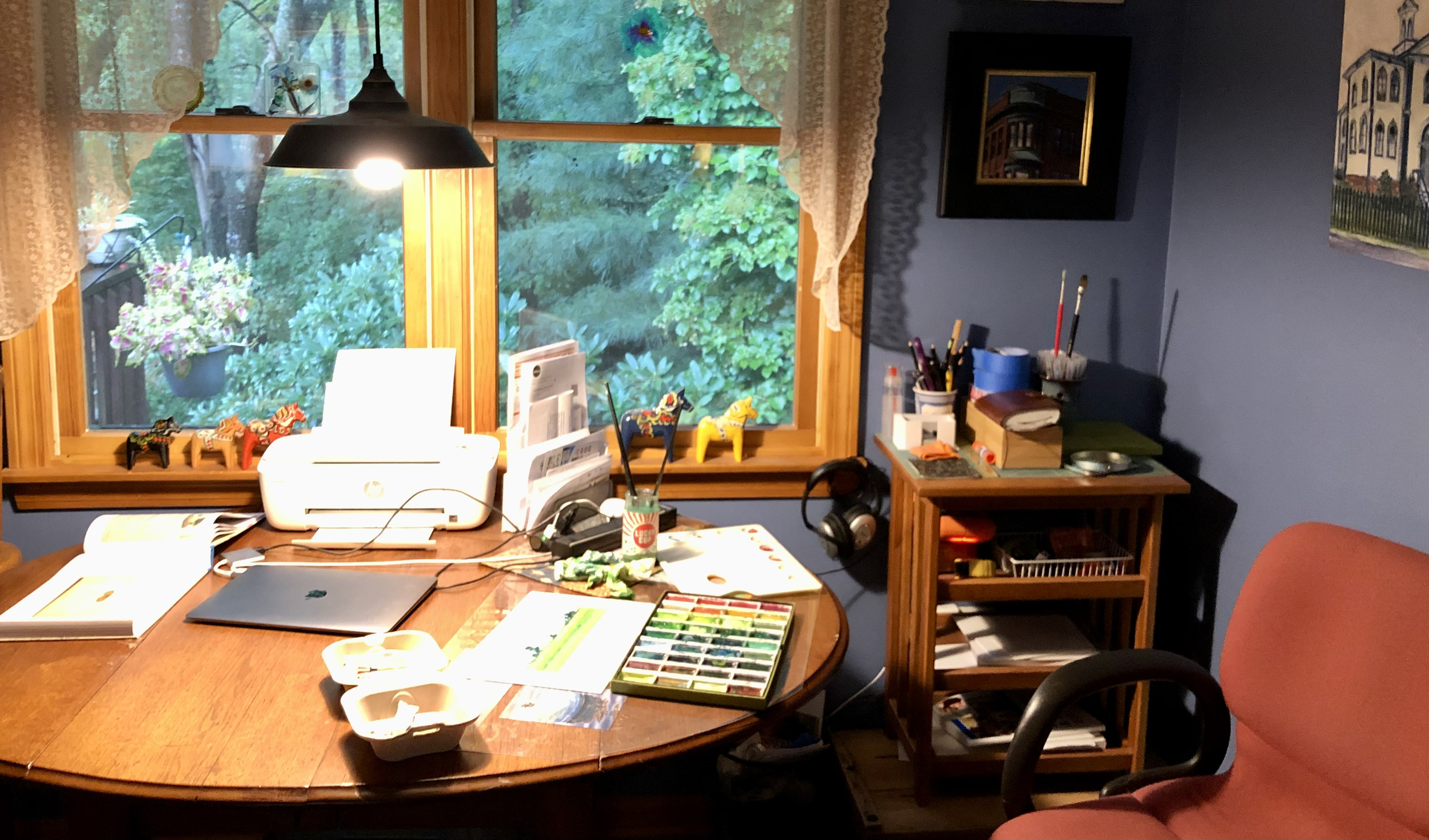
Yes, I’ve expanded my workspace…in a manner of speaking. Due to extenuating circumstances, I had begun to find it difficult to utilize my former studio space to its fullest, so I had to make some changes. In my case, it was an easy fix, especially since my recent work has morphed into both smaller dimensions and a less cumbersome medium, that of watercolor. Which came first - the new direction or the workspace? Doesn’t really matter. The fact is we all adapt and roll with the punches in life, and this was no different. My living space has a solid table right next to a view of the back woods and bird feeders. So here I toil now, comfortable and but a few steps from my bed and coffeemaker. I can stop for a nap…or a caffeine fix. And, when the time is right, my old, more “remote” studio sits right below me, ready to welcome me back.
Because of this move, at least partly, my output has increased and pushed into new territory. Yes, watercolor began as a girlfriend visited on the side surreptitiously, but as these affairs sometimes do, she’s moved right in and, for the moment, stolen my heart. She allows me to lose control, see things differently and express myself in new exciting ways. Oh, I’ll go back to the oils eventually (the smell of turpentine still lingers), but for now, I’ll continue to wade into the water with abandon.

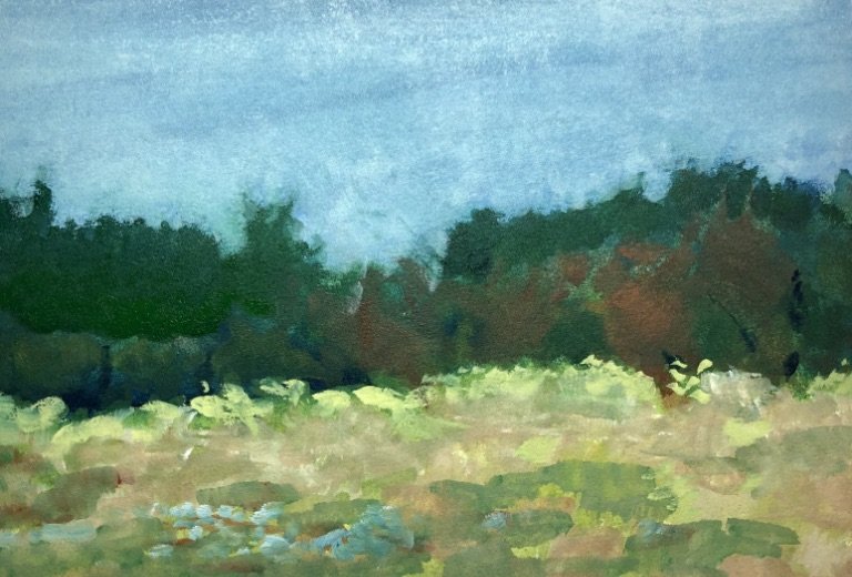
Westport Field, 2022
I’ve just updated my webpage if you want to take a look at the recent work. Still evolving, but there’s been some level of success, I think.
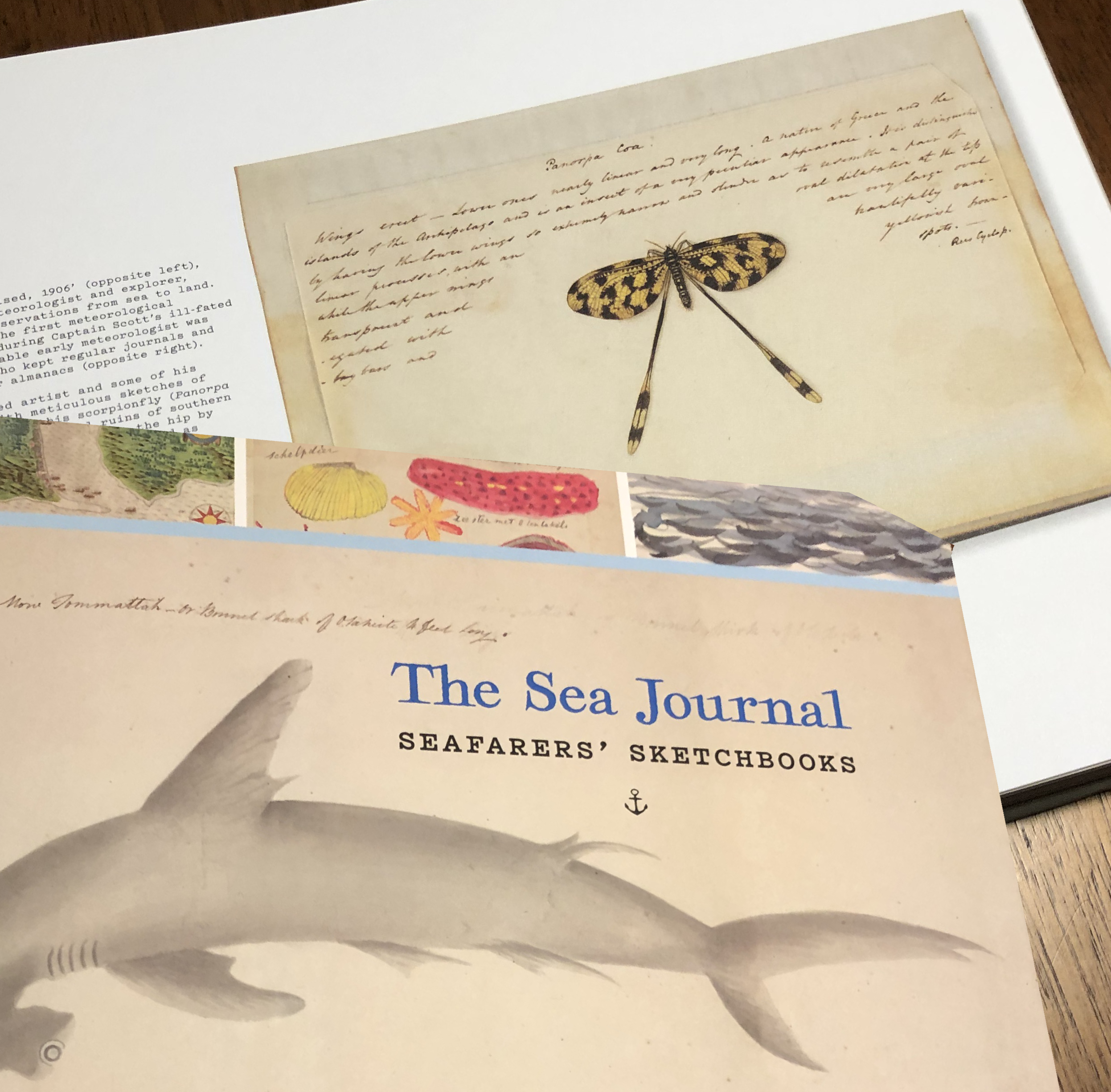
Over the years, I’ve kept a journal of some sort to capture all the ephemera the ADD mind can generate. I mentioned my earlier notebooks in an earlier post. Add to that piles of sketchbooks, napkin drawings, photographs and such and the pile gets higher and higher. So, when my son and his girlfriend gifted me the book shown above, it was right in my wheelhouse. Add to that my connection to the venerable old port of New Bedford, MA and, well…
This is a rabbit hole of a book. 300 rich pages of records, formal and informal, famous and pedestrian, written and drawn. Each spread is fascinating in it’s own right, imparting stories that would have been lost, had a bored sailor not felt compelled to make it real in his own way. Some of the drawings are scientific and some are quite crude, but all are compelling and wonderful. Edited by Huw Lewis-Jones (didn’t he front a band back in the day?), I highly recommend it.

On another note, the most recent Smithsonian magazine featured an article on a new Roman mosaic floor discovered in the Middle East. I’d tell you exactly where, but I “filed” the magazine somewhere unknown to me now, and that doesn’t matter anyway. What really struck me was the contemporary feel to the imagery. Perhaps it is the amazing condition it was in, or the pixelated effect of the small colorful tiles, but I felt like I was looking at stylized illustrations for a modern logo mark. Beautiful!!


Upcoming Show
I’m happy to announce an upcoming show this coming September. It will be held at True Grit Art Gallery in Middleboro, MA and features a wide range of my work, both past and present, in oils, acrylic and watercolor. Please join me at the opening reception on 9/10/22 from 6PM - 8PM. The gallery is on Center street in downtown Middleboro, right across from a great restaurant and whiskey bar called The Charred Oak. Why not make an evening out of it? It would be great to see you!

Wandering Joyfully, Aimlessly
I was lost.
When I shut down the business aspects of Intramural Studio, I expected to jump right into a regular, unencumbered path of happily painting and expanding my body of work on my own terms. But, like most expectations, things failed to align the way I’d envisioned, and after a couple months of frustration and panic, I arrived at the realization that I was, indeed, truly lost. I was having trouble in the studio. The effort felt forced and the work stale and dead.
But, now I’m found.
The solution was discovered in my own studio journals from back in the early 80’s when I was first embarking on the unpredictable road of artistic life. Like many of us who keep journals, diaries and such, the value lies not necessarily in the words themselves, but in the very act of articulating one’s thoughts. Venting, wondering “aloud” and getting your thoughts out of your head and onto paper often acts as the perfect, safe relief for what ails you. I once had a co-worker who encouraged me down this paper path - she started her unsatisfactory job each day by composing a private, facetious “letter of resignation” in the morning. It was her own method of cheap therapy to help her cope with a less than ideal situation.

So, it was a bit of a surprise when, in perusing my early journals, I came upon words from the past that did indeed offer advice and guidance. Words about patience. Words about trusting oneself and actually just moving ahead with little or no plan at all. Leaving yourself open to the freedom and joy of discovery. It sounds a bit silly and obvious now, but I realized that over the years that I applied myself to commercial ends, I had so developed and honed the structure, process and compromise skills needed in that world that I was having difficulty remembering what it was like before. Before business plans. Before Creative Briefs. Before bookkeeping, meetings, emails, budgets and performance reviews. In short, I had forgotten how to play.
And play one must if one is to grow as an artist. Because when you play, truly play, you open yourself to the unexpected. The joy of finding a new way to express yourself and contribute to the art that you don’t even know is inside you. Play unlocks creativity. Play has no expectations and fears no failure.

And so off I go, into the playroom that is my studio. I’ve tucked away my oil paints for the time being and am looking into other toys. I’m casting resin, making marks with graphite chunks, collaging and working from inside my gut instead of my brain. It’s exciting…and though it could be scary, when you don’t think about it, it is freedom personified.
It’s all part of the journey. I can’t wait to see where it takes me.

Kerowackathon & Vonnabaloo!!
Each spring, around the time the jonquils bloom and the peepers resume their annual chorus, I re-read “On the Road” by Jack Kerouac. I started in the spring of 1980. I don’t know why I picked it off my bookshelf back then - just impulse or whatever. I had read it at least 2-3 times by then. It was my favorite book, in fact. I read it that day in 1980, in one sitting, and though my eyes were tired, my mind was certainly not. I felt invigorated, energized and even a slight bit manic. I remember thinking - this is like a mental spring tonic, I need to do this every year. And now, 42 years later, my tradition (obsession?) carries on. I will note that I’ve NEVER SINCE read it in one sitting…that would be nuts.
With March 12, 2022 marking the 100th birthday of Msr. Kerouac, I decided to extend the journey to include his entire canon, even the poetry (not so hot, in my humble opinion, especially when it sits on the bench next to poetry sluggers such as Snyder, Ginsburg and Duncan). It would be fun to revisit old stories and characters, but also to shoot me a double-double dose of spring tonic and get me out of a winter-long creative funk.
I was introduced to the writing of Jack Kerouac during the summer of 1973 by my friend Mike. We were talking during a lunch break at work and he mentioned a cool book about zen backpackers in the High Sierra’s that he thought I would like. That book was The Dharma Bums. From there, I read “The Subterraneans” and was hooked. Funnily, it wasn’t until the third or fourth book that I read “On the Road”. Perhaps I was sneaking up on it because I subconsciously knew that - likewise for millions of young, optimistic, creative bohos - it would change the way I thought of pretty much everything.
Everyone has a coming of age book (or if they don’t, it explains a lot about them) that marks a distinct moment in their lives that the lights went on and some sort of internal calibration completes itself. Suddenly you get it. You even get what IT is, which you didn’t even know that you didn’t know. Anyway, On the Road was, to me, a multi-dimensional story that entertained me in a completely different structure, tone and soulfulness than anything I had ever read before. I understood Jack’s voice and gentle optimism.

That very same summer of 1973, my friend Dennis let me borrow a small brown paperback called “Welcome to the Monkey House” by a writer named Kurt Vonnegut. I devoured every hilarious, cynical sentence in it, and there I went, off into as many of his books as I could find. And he took his place in the curriculum of my youth.
So, it’s only fair that he joins Jack in my summer reading diet. No order or reading strategy - only what comes spontaneously (Nyuk, nyuk, nyuk). At any rate, between the two of them, I hope to gain direction and creative clarity or at least a nudge in the right direction.


Martian Landscape, as captured by the NASA rover Perseverance
A New World
In my internet wanderings recently, I happened across a mesmerizing gallery of images from Mars. As landscapes, the images are not really what you’d call beautiful, (unless you’re a geologist) consisting of monochrome fields of rocks and dirt. So what. Hey, what about the fact that… they are from friggin’ MARS!! How complacent with high technology and engineering are we that these pictures weren’t splashed everywhere across the internet? I don’t have the data, but I’d bet the house that Kim Kardashian got more hits at the time NASA released the Mars images. Not that long ago, the entire world came to a standstill and crowded around small black & white televisions to decipher the shadowy, grainy images from the first moonwalk. The moon is only a hop, skip and jump from us. The crisp, color images from Mars have traveled at least 34 million miles! Truly and literally amazing.
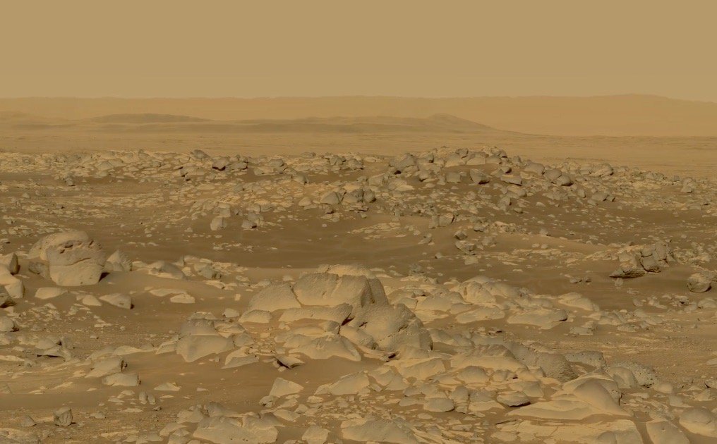
Martian landscape, as captured by NASA rover Perseverance
And this got me thinking about the delivery of the first images from a former “new world” that happened in the late 1500’s when explorers and entrepreneurs ventured to that era’s version of Mars - the North American continent. Though the technology back then consisted of graphite, ink and watercolor paint, the task was the same: capture the beauty of a wondrous new land and bring it home.
One of the first to attempt this was John White, a English artist and intrepid traveler who is credited with making the earliest images of America. White traveled with the early settlers to Roanoke Island in 1585, where he was commissioned to make watercolor sketches of the natives and their world. These images were copied into engravings back in England and widely published and marveled over. Incidentally, White was among the party that returned to Roanoke three years later and discovered the mysterious disappearance of the colony.
I wonder who will be the first artist to paint plain air on the Red Planet?

Watercolor by John White, circa 1585

Watercolor by John White, circa 1585

Sentinel #2 - 2021, oil on cradled wood panel, 12 x 18
Standing Watch
A new series of paintings are evolving in my studio. Returning to the beautiful landscape of the Southcoast where I first started painting in earnest, I’ve connected with those solitary trees that somehow survive all manner of harsh weather and topography to rise above the grass and low brush. They appear to me as sentinels the shore, steadfast and sturdy, hardy and headstrong. They are gnarled and twisted by the elements, yet have a resolute beauty all their own, rising above the sweeping dunes and leaning against the wind.

Sentinel #1 - 2021, oil on cradled wood panel, 12 x 18
In these turbulent times of global pandemic, threats to common decency, common sense and common good, we all need to stand watch, I reckon. Things of importance to us, both collectively and personally, need careful and measured observation, lest they disappear. Maybe that’s what these vigilant trees are telling me - don’t take for granted that which we hold dear, lest they leave us before our very eyes.
Or perhaps I’m channeling an important influencer of my landscapes, Tom Thomson. If you don’t know of him or his “posse” of fellow Canadian painters, The Group of Seven, please look them up. Thomson’s most famous work is The Jack Pine (see below) and it is a strong example of a confident painter at home in his element.

The Jack Pine, 1916-17 by Tom Thomson
Whatever the reason, I love these trees and will keep on painting them until they tell me to stop. Pax vobiscum.
Get Back to Where You Once Belonged
I witnessed two incredibly inspiring things this past week.
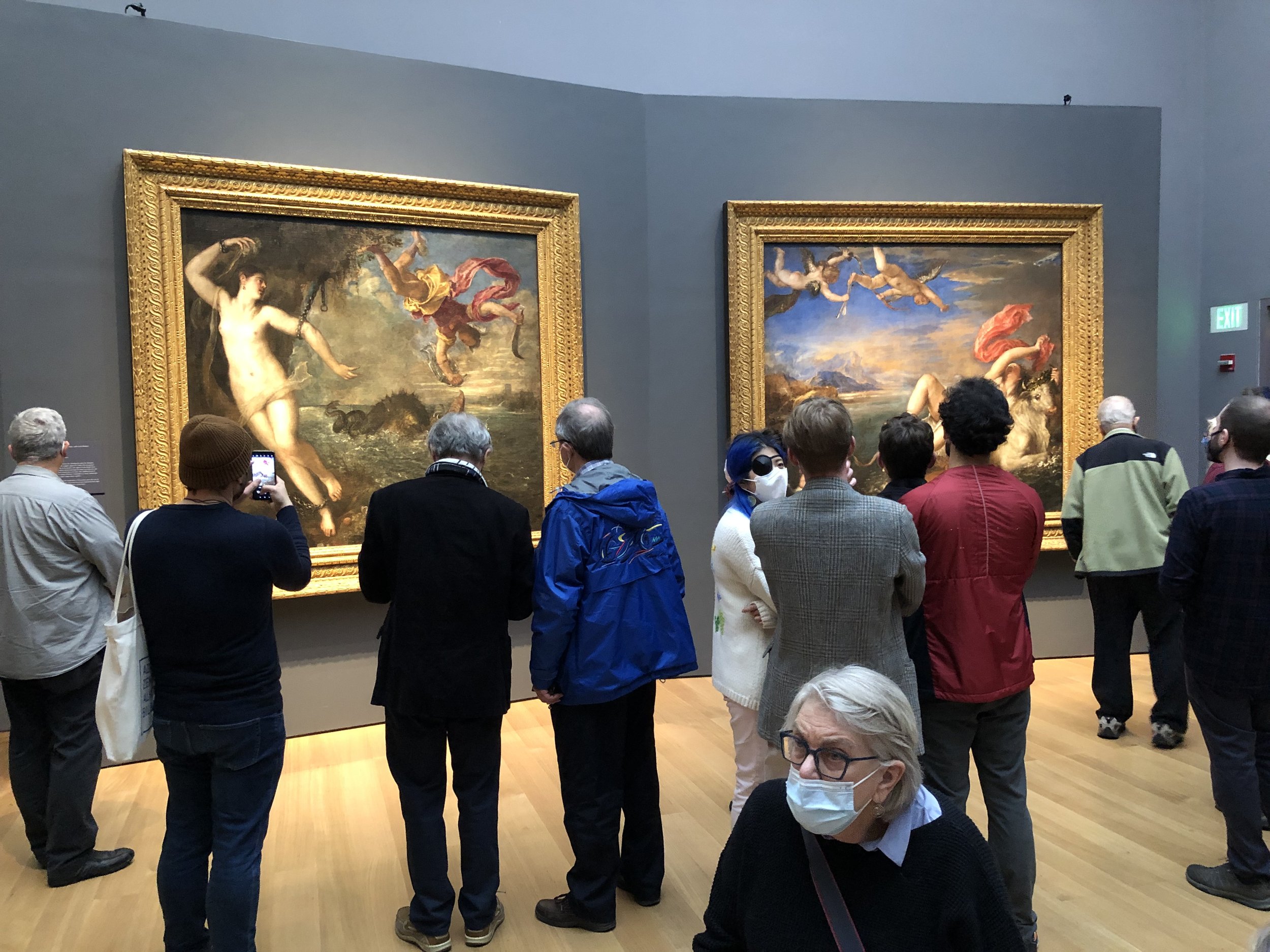
The first was the six hour long, re-tooled Beatles film by Peter Jackson (now appropriately titled “Get Back”) and the second, the absolute gem of an art exhibition at the Isabella Stewart Gardner Museum, reuniting the six Titian “Poesie” masterpieces into one room. At a time of the year when most of our collective attention is forced away from anything meaningful by the ceaseless onslaught of holiday consumerism, both of these events were most welcome and refreshing. I consider them an early Christmas gift that I will treasure forever.

The original Beatles film, “Let It Be” was released in 1970 when I was 13 years old. Because it was 1970, it released in movie theaters only, and, living in the sticks, I didn’t see it until much later, but I remember the general consensus at the time was that it was nothing more than a sordid chronicle of a musical divorce, highlighting the bickering, in-fighting and back-stabbing of the once lovable “Fab Four.” Despite being a fairly solid Beatles fan, I remember not wanting to see it because it sounded depressing. I did tune in with my family to Ed Sullivan when he premiered a portion that introduced us to the new song “Let It Be.” Though I liked the song from the get-go, I was disappointed that it wasn’t live and only a pre-recorded film. It felt like a cop-out, compared to the excitement of the original Sullivan performance six years earlier.
This film, gleaned from sixty hours of original tape footage, piqued my interest from the moment it was announced. First, it was being edited by Peter Jackson, a master filmmaker, and second, the music was being produced by Giles Martin, son of the “fifth Beatle,” George Martin. Jackson’s touch promised an influx of a true fan of the band, and Martin has always been an ardent archivist and handler of their musical heritage.
So, why was this rock n’ roll extravaganza such a meaningful moment for a humble painter? Because it is a rare, lightly (if at all) edited recording of the creative process. Unencumbered by any outside demands, three pioneers - (sorry, Ringo) - OK, really two and a half (sorry George) of a groundbreaking art form - are shown behind the curtain, crafting music that is as powerful and memorable today as it was fifty years ago. Many will consider it monotonous, but I couldn’t take my eyes off the spectacle. It was as if, dare I say it, someone was there to film Michelangelo painting the Sistine Chapel. A priceless historical record.

The great Titian painting, “The Rape of Europa” was required viewing for painting students when I was in Art School. Our teachers’ stressed that not only was anything by Titian very rare, this one was by far, the most important Titian in North America. I found out later that it was actually the first Renaissance painting EVER to come to America. The piece itself is one of six mythological scenes painted by Titian for King Philip II of Spain, and this show represented the first time in 500 YEARS that they were all reunited into the same room, as the artist intended. 500 YEARS!! That alone is impetus to get to the show. But, when you get there and are actually standing in this (sorry, John Updike) quaint little bandbox of a gallery, the beauty and mastery of the artist washes over you and I, for one, was truly awe-struck. As a painter, and student of painting, different things hit you all at once - the design of the groups of figures, the interaction of their limbs and, especially, their gazes - the color, most notably in the skin tones. In fact, I focused for a long time on the warm colors and values of the black woman in the lower right corner of “Diana and Actaeon” Rarely have I seen such nuance in the flesh of a person of color in work from that era).

As I’ve written before, the arts are, at a base level, about telling stories. In the space of a week, I was privileged enough to see both the process of making something exceptional out of nothing and the reuniting of six chapters of a mythological tour de force. Four scruffy working class musicians from 1970’s England and one middle-aged painter from 1500 Venice. Same purpose, same passion.

Left: Mary Magdalene by Nancy Carrozza-Caradonna. Right: From the Arrested Series by Dick Dougherty
Sinners and Saints
The images above are details from paintings by two of my artistic comrades, both of whom I hold in the highest regard. Dick Dougherty was one of my instructors at Swain School of Design back in the 70’s. He taught me how to draw, how to determine tone and value in painting and, along the way, some art history as well. Nancy Carrozza-Caradonna was a classmate of mine from grade school through high school and then art school. She has taught me many things, among them an appreciation for figurative painting and how to embrace the passion of the art world.
Though I myself don’t often paint figures or portraits, their recent work leaves me stunned. Technically, they achieve things I would have much difficulty duplicating. They are both master draughtsmen and their sense of light is sublime. But beyond that, it is the capturing of a subject’s soul that amazes me. The depths of emotion they mine from a human face is breathtaking and moving.

Saint Catherine of the Wheel by Nancy Carrozza-Caradonna
There’s another thing too. As I studied their work more closely, it was clear that there were singular similarities in the expressions of fear, pain and suffering in one group and introspection, self-doubt and even sadness in the other. AND, oftentimes, those emotions are indistinguishable.
Put another way - it’s a thin line between Saturday night and Sunday morning. We are most certainly ALL sinners and ALL saints. And we should remember that before we judge one another. Peace to you all this Thanksgiving.

Arrested #H-11M2117 by Dick Dougherty

Saint Agnes by Nancy Carrozza-Caradonna

Arrested #121216G by Dick Dougherty

Note: The image above is NOT of my studio (it’s Francis Bacon’s actually), and though mine is nowhere near that bad, it IS a catastrophe and needs a good purging.
What A Mess!
The time is here. The time is now. My studio is a landfill and must be cleared of extraneous flotsam, jetsam, and yes, paintings that have outstayed their welcome. They are a combination of older pieces, experiments in both material and concept and some just plain outliers. Even though I’m tired of them, they might be perfect for someone else’s collection…or a nice holiday gift. Just click here and check out the gallery on my webpage. There’s no supply chain issue to worry about AND you’ll be supporting local arts and not the joy-rides of rich, white guys into space!

Return to Reality
After what seemed like forever, the past summer was, for many of us, a slow reentry into the world outside our homes. For me, nothing epitomized that more than looking at art “in the raw” so to speak. On walls, in galleries, in parks, non-pixelated! Carefully I ventured into once familiar venues to gratefully experience the full force of unadulterated color, texture and presence of wonderful things, intriguing things, beautiful things. Here’s my summer highlights.

First up, I trekked out to Mass MoCA. As I’ve written in the past, MoCA is sanctuary of sorts to me. It opens my mind to possibilities and different ways of thinking visually. This visit certainly did that, especially the “Into the Light” experience by James Turrell. Walking literally into a room of immersive, ever-changing color is unlike anything I’ve ever felt. All sense of ground and perspective goes away and, if you let it, the light/color takes you places that are sensually overwhelming. It was like leaping into space, and a fitting reentry into the art world.
Next up was closer to home. As part of DATMA’s (Design, Art, Technology in MA) 2021 Water exhibit, the Swiss sound artist, Zimoun brought a wall of sound to the party. Created from corrugate boxes and motorized cotton balls, the installation presented an interpretation that surrounded you with mesmerizing sensations.

Around the corner from the DATMA installation, the New Bedford Whaling Museum presented a small, but compelling exhibit of a very influential American artist, Albert Pinkham Ryder. A painter mostly unknown to the general public, “Pinky” Ryder was well before his time in expressionist vision. He was able to distill form and color into the basics, saying just what he had to say, visually, in well-placed, raw marks and strokes.
By now, I realized I was perhaps subconsciously easing back into looking at art slowly and carefully, weaning myself off the faux-images I had been looking at on screen for the past 2 years. Looking at pure sensation of light, color and then sound, I felt like I was taking baby steps back into an old reality. I was ready now to take a bigger leap into the big-time. I was headed to the Museum of Fine Arts.

Ekua Holmes, Precarious, 2017
I wrote in an earlier post about my re-immersive stroll through the Museum, slowly reacquainting myself with the familiar rooms and pieces. What I didn’t dwell on was a new discovery, Ekua Holmes. An artist of color from Boston’s Roxbury neighborhood, Holmes’ work was a vibrant multi-media avalanche of brightness, harmony and emotion. Most of the work centered on her children’s book illustrations and civil rights pieces, but I was especially struck by her family portraits.

Nikolai Astrup, detail from Growing Season Weather, 1918-21
Toward the end of the summer, returning from a pilgrimage to Cooperstown and the National Baseball Hall of Fame, I veered off to return to the Berkshires to see a rare US showing of Nikolai Astrup. I was extremely glad I did. A contemporary of one of my artistic heroes, Edvard Munch, Astrup was hitherto unknown to me, though very popular in his native land of Norway. His landscapes are humble representations of a quiet agricultural life in his family homestead with a particular passion for the details of the natural world he so loved. It felt to me personally, like a calling to pay special attention to what is right directly in your field of vision - and to be grateful for what you have, each and every day.
All in all, a full summer, especially if you include the many local shows I took in. Now it’s time to get back into the studio and put brush to panel.
Pax Vobiscum.

New Show!
I’m happy to announce an upcoming exhibition of recent paintings which will be held in Bridgewater through the month of September. It marks the first showing of my “Soundtrack” series, which draw inspiration from the musical playlist in my studio during their creation.
The show runs September 2 - 29, 2021 at the Flora T. Little Gallery in the Bridgewater Public Library, 15 South St., Bridgewater, MA. For exhibition hours, visit www.bridgewaterpubliclibrary.org. And if you’d like to join me at the opening reception, that will happen on Tuesday, September 7 from 6:00-8:00PM. Hope to see you there!
Besides being thrilled for the opportunity to show art on an actual physical wall for people to see in person, I’m also excited to return to the gallery in which I first hung artwork 40 years ago. I was a 24 year old art school graduate in 1981, earning my rent by laboring on a loading dock while painting at night in what I dubbed the “2Car Studio” behind my apartment. Music was an important ingredient to my process even then, mostly late night jazz provided by Eric in the Evening on WGBH.
Here’s a piece from the 1981 show. Many similarities to my new work, I think.

Hymn to the Railroad Earth - 1980, 24x36, oil on canvas - Private Collection

Artist Once Known
During a long overdue field trip to Boston’s MFA (more on that below), I was struck by something I had either overlooked in the past or, in fact, is new museum policy. What I noticed was art that in the past had been labeled “Anonymous” or “Artist Unknown” were now marked “Artist Once Known.” At first pause I thought the phrasing a little odd, but upon reflection, it made me smile. Sometimes the smallest detail can project very significant change, and this, I thought, was one of those moments.
Now, as I continued through the galleries, I was on alert for this new discovery, and it soon became very obvious that most of the pieces thus marked were in the African, Native American and Asian collections. True, those pieces were often very old and would have been difficult or impossible to attribute, but many were fairly recent (in the scope of art history). Which leads me to believe that there was not a whole lot of effort by early archaeologists to identify the makers. In fact, it is usually the Anglo discoverer whose name becomes forever associated with the artifact or art piece. Not fair! How many dedicated and talented artists and craftsmen are now lost to history?
I read somewhere that a person dies three times. Once when the body stops working, the second when it is consigned to the grave and the third that moment in the future when the person’s name is last spoken. With that in mind, it made me a little less sad to see the acknowledgement that, at least, these men and women art makers that left us such beautiful and compelling gifts were “Once Known,” and recognized that they were human beings who once had families and friends—and names.

On a less philosophical note, our trip into Boston to revisit the galleries of the MFA was so very satisfying. After more than two years away, it was heartening to see that I still knew my way around the old familiar neighborhood. Seeing REAL artwork!! The texture of the paint on canvas, the ambient light reflecting off the statuary! No pixels here, dammit!! It was like hearing live music, feeling the weave in a cashmere throw and smelling fresh baked bread all rolled into one. With no agenda, plan or map, we wandered intuitively and simply ingested that which had been denied us for too long. By the time we left my eyes were as exhausted as my feet, but my soul was rejoicing.

“A Show of Hands” from 17,000 years ago - Artists once known

Arborglyphs, Tree Spirits and Stuff by the Wayside
So what is an arborglyph anyway? In a few words, it’s a tree carving. Petroglyphs are on rock, arborglyphs are on trees. And though correctly discouraged by botanists (carvings are literal wounds that often become infected and harm the tree), they continue to show up as sculptural graffiti in wooded spots everywhere, especially public parks and recreational areas that offer the seclusion necessary for time-consuming knifesmanship. No longer just initials captured in hearts and peace signs, there are some very clever, crafted and sometimes mysterious examples out there. Crude calligraphy included (see above).

I collect stuff like this - in photographic form. Things like spray-painted tags, yarn bombs, brick art, stencils, wheat paste posters, mosaic, asphalt writing, wet cement tagging, and a myriad of other public expressions of creativity. I love the simple surprise and delight of coming across these treasures during the course of my daily wandering. And since I always have a camera handy - cleverly disguised as a cellphone - there’s no reason not to take a shot and send them up to my own little piece of the cloud for future inspiration.
I’m not entirely sure why I do this. I guess it’s a comfort to me that someone is compelled to put something they made out there, anonymously (usually), and without compensation, to be discovered and enjoyed.

While we’re on the subject of trees, a few years ago I stumbled upon the carving above on St. Simon’s Island, Georgia. It was tucked away next to an Irish Pub my friends and I had just been asked to leave (but that’s an entirely different story - something to do with an errant billiard ball and a bar mirror). Anyway, clearly this was more than a guerrilla act of wood carving, I dug around on the internet and found it was one of a group of carvings across the isle, dubbed Tree Spirits, created by local artist Keith Jennings. I didn’t have the time to search out the other spirits, but was heartened to know that the spirits were there watching over reprobates and fools.

And just last week while walking a trail with my wife, we discovered the object above tied carefully, but in a pretty non-obvious spot amongst the dune flora. You really had to be paying attention to see it. Constructed of seabird feathers, twigs and twine, it may be a rudimentary shuttlecock, or a reconstruction of a Native American shamanistic totem, or who knows? All I know is that I was delighted to come upon it, as I am with all these found masterpieces. So, keep your eyes open, as well as your mind - the whole world is a gallery.


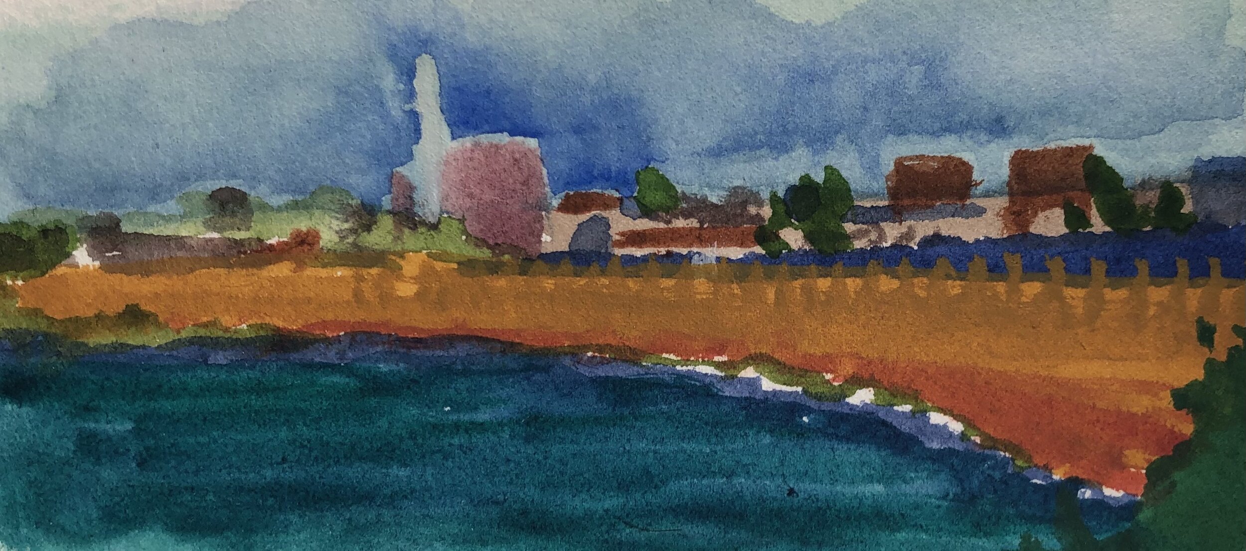
Gooseberry Island from Horseneck, 2021, watercolor one paper
Outside
It’s summertime and the weather is hot and traveling to the edge of the sea for a cool breeze is the perfect opportunity to get in some work “en plein air,” as they say in Neece, Marsay or Provahnce (or in art school). I call it painting outdoors. There was a time when this was the only type of painting I did and wouldn’t have thought about doing otherwise. If you’re a landscapist and you’re blessed to live in a region that offers such diverse options New England, why wouldn’t you? There is no doubt in my mind that working outdoors offers a richer palette, truly unfiltered reference material and the satisfaction of sensual interaction with the ultimate source - nature.
But I now prefer to work indoors - for two reasons: first, I’ve come to enjoy a slower pace of working than painting from life affords. You need to paint fast or adjust by making multiple sittings, and many artists do so with great success, but I personally would find that difficult and logistically complicated. In my studio, I can control the pace and everything is right there where I left it. Secondly, I like the challenge of creating not only the composition, but the palette and atmosphere of the piece. Knowing I can never totally replicate the beauty of the natural world offers me a mental and visual puzzle to solve - sometimes in ways that are anything but natural. Or, maybe I’m just a control freak…
This doesn’t mean I don’t enjoy forays outside though, and good weather served up with a well-made cold brew coffee in hand is a strong catalyst. Small live studies, like visits to museums, galleries and, actually, life itself, are the consumables that I draw from when I am before the easel. You must balance the intake of an artistic life with the output. Thus, painting from life here and there is a way for me to feed the beast and stoke the engine out of which I make art.
Hurricane Barrier from Fort Phoenix, 2021, watercolor on paper
Funny side story - and most artist’s I know who work plein air, especially in populated locations, have signature interactions like this with curious onlookers. I once set up my French landscape easel in an urban area to capture a street scene. Over the course of the morning a few people passed by, strolling to work or what-not. Most gave slight acknowledgements with a nod, smile or perhaps a brief comment (“Beautiful!” “Awesome!” “Nice work!") But one woman stopped and silently stared at me for quite some time. She was pretty old, with a distinct “old country” appearance - all in black, long skirt, black kerchief over her head and a large cloth shopping bag in one hand, filled with her market purchases. She watched me for what felt like a long time, never saying a word, until passing by me muttering, “You’ll never make a living.”

Surf Study, 2021, watercolor on paper

Nighthawks, 1942 - Edward Hopper
Every Picture Tells a Story...
…Don’t it?
Yup, as does every sculpture, interpretive dance, performance, film, and any other manifestation of art. And so it has always been, from the time of marks on a shelf of sandstone in the desert, the oral recounting of a day’s hunt by a shaman to a projected hologram in the sky and a compelling arrangement of pixels on an LED screen. “The most powerful words in English are “Tell me a story” according to the writer Pat Conroy, and artists are put here to present those tales, limited only by the technology of their times, unfettered imagination and supreme effort.
And the thing is, no matter the effort, skill and persuasiveness of the artist, the story they tell can never be completely finished - not until the mind of the receiver (or viewer, listener, audience, whatever the case may be) completes it. That’s the true magic, and to me, the ultimate creative collaboration.
So, in my role as a maker of 2-dimensional art, I sometimes feel a bit confined by my medium, unable to convey more entry points to the story I’m trying to tell. I don’t have the sound and motion tools of a filmmaker, or the long format of a fiction writer, for instance. I need to be concise and clear, poetic and clever - enough to hold the viewer’s interest long enough for them to create the perfect ending to their experience of my tale.
Which leads me to the titling of my work.

Into the Mystic, 2021 - Randy Swann
Creating a title for a painting can be daunting, which is why many artists fall back on the simple and obvious, or, for the lazy/uninterested out there, the old standby, “untitled” which many use as a strategy to let their visual piece speak for itself, I suppose. I’ve used both, but lately I’m thinking differently. It started with my frustration in fielding the inevitable question posed to a landscapist - “Where is that?” I say frustrated because I often really don’t know where the scene is. As I’ve said in a previous postings, my process begins with collecting images…lots of images. So many I don’t remember where they came from. I could easily find that information in the metadata in my Photo library, but that’s not the point. The point is that I’m usually not painting a portrait of a place, but the setting of a story. But then, what do I expect? I’ve titled the damn thing “Fall River Tenement” or some such thing. If that’s not enabling, what is?
I thought a lot about this and realized that another part of my process might offer a solution - a soundtrack. Music has always been a big part of my work in the studio. I take great care in selecting a playlist that reflects what I want to infuse into my painting. I think it affects my palette, my mark-making and, ultimately, the story I’m trying to tell. Not willing (or technically able) to physically connect sound with my work, I’ve opted to try and connect the two by “borrowing” a song title that reflects what I, the maker/storyteller, am hearing in my mind as I present my tale. I’m hoping that some viewers (the musically astute ones, at least) will read the title and subconsciously start hearing the song in their heads. It’s led to some surprising results and opportunities to even add in subtle visual play as well.
Here’s the question I asked myself as I pondered this problem: If Edward Hopper’s “Nighthawks” was titled “Corner of Seventh Ave. and Park St.” would it tell the same story?
Good question.

Paint it Black, 2021 - Randy Swann

Goin’ Mobile, 2021 - Randy Swann

Spring Cleaning
Yes, after a long, claustrophobic winter, it’s finally spring studio cleaning time again. Time to sweep the cobwebs and empty Dunkin Donut cups. Time to prep fresh panels, chuck dried up paint tubes and weed out dead brushes. And time to make room for new work by releasing older pictures into the wild. So, if you’d like to help me out by purchasing one of the pieces below, drop me a line at rannswann@gmail.com and let me know.
To be clear, these pictures are not “seconds” or inferior work in any way. They are simply older pictures I’ve taken all I can from and are now in my rear-view mirror. I’d much rather see them placed in a good home than stored out of sight.

Easy on the Starch, 2020 • oil on cradled wood panel • 18 x 24 • $450

Across the Taunton River, 2016 • oil on cradled wood panel • 12 x 24 • $400

Affair @ Borderland, 2010 • oil on canvas, framed • 12 x 10 • $300

Bungalow with Red Car, 2017 • oil on canvas, framed • 8 x 10 • $250

Crossroads, 2020 • oil on cradled wood panel • 12 x 24 • $400

Down By the River, 2017 • oil on cradled wood panel • 12 x 24 • $400

Green Bungalow in Winter, 2017 • oil on canvas, framed • 8 x 10 • $250

Horseneck 1, 2019 • watercolor on board • 5 x 10 • $60

In the Dunes, 2020 • watercolor on board • 10 x 10 • $80

Moab Bungalow, 2017 • oil on canvas, framed • 8 x 10 • $250

Overgrown Bungalow, 2018 • oil on canvas, framed • 8 x 10 • $250
Portland Intersection, 2014 • oil on cradled wood panel • 12 x 24 • $400

Tabor Point, 2020 • watercolor on board • 5 x 10 • $60

Top, 2016 • oil on canvas, unframed • 10 x 8 • $250

Trail Marking, 2019 • watercolor on board • 5 x 10 • $60

Union and Dunham, 2018 • oil on cradled wood panel • 12 x 12 • $250

Crayons
I love the smell of crayons in the morning. They smell like…possibilities.
Seriously, what tool can deliver so much out of such simplicity? When, as children, we first picked up one of these humble, paper-wrapped sticks of colored wax, we were introduced to a lifetime of harnessing the palette of the world around us. And as we progressed from big-headed figures, star-like suns and rudimentary houses to more complicated drawings, one thing never changed - the rainbow of colors at our fingertips. Artists, as the old quote goes, just never put their crayons away.
So today I thought I’d give you a peek at the pile of crayons I use and talk about my palette. I do mix things up here and there, experimenting when the mood suits me, but I would venture to say that it has changed little in the past forty years. I started out using a modern adaptation of “Pissaro’s palette” as do most art students, then expanded and detracted colors as I learned more about my needs. Though I expect there will be more changes down the road, at the moment I’m very happy and confident in my arsenal of dependable pigments.
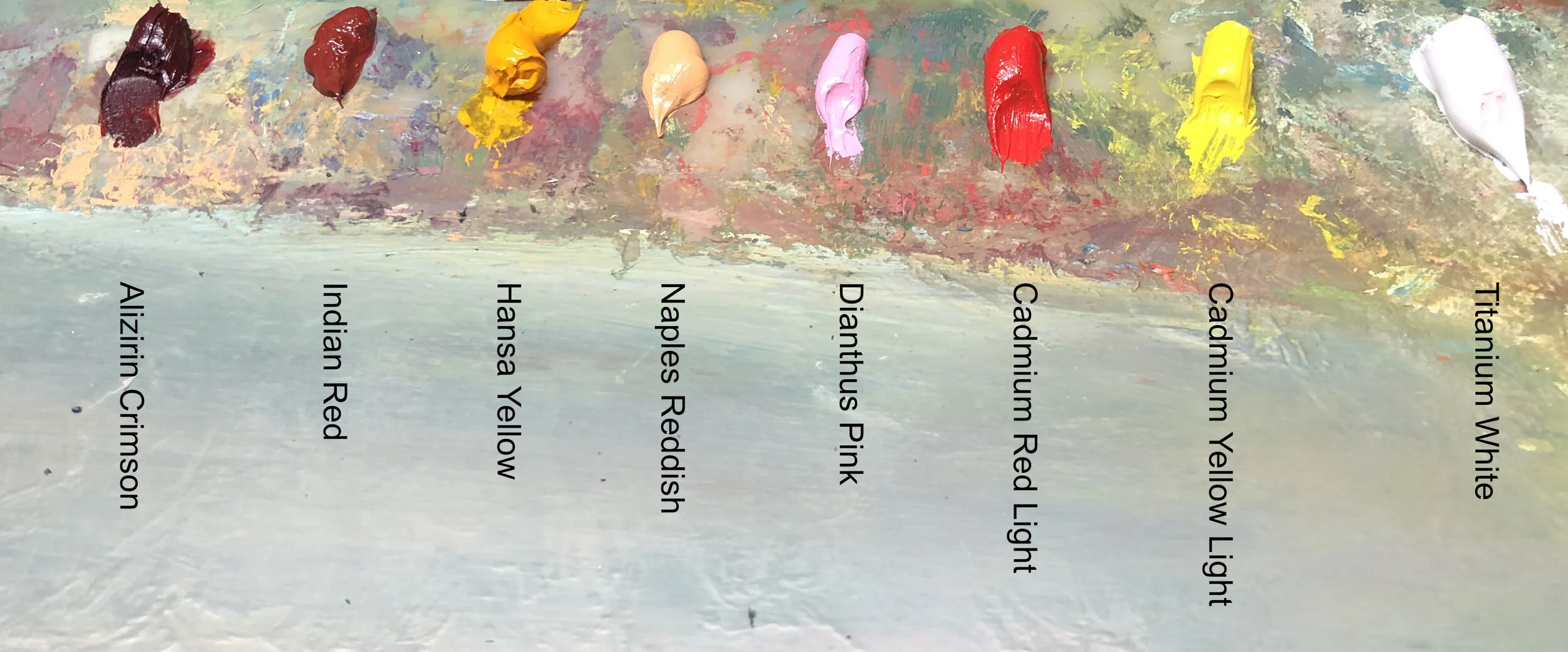

I won’t bore you with a screed on each of them, but there are a few pigments to which I have developed a strong affinity. I love these favorites for their feel, versatility and sometimes even their smell, but most of all I need them for the way they work with others. One of them, in fact, isn’t even in the pictures above and that’s because I keep it separate and as clean as possible. That hue is Yellow Ochre, and I use it for underpainting and developing tonal planes at the outset of a picture. It is an earth pigment, and very easily overpowered by other colors, hence it’s quarantine.

On the other hand, I love the power of Indigo. I use it often as the base of dark tones, albeit carefully as it is so strong. BUT, it’s not as powerful as the more commonly used Prussian or Cobalt Blues, both which seem to spread throughout a wet canvas like a fog. Indigo is, of course, an old pigment, traditionally extracted from the leaves of the Woad shrub. There is also a synthetic indigo, but it is not used in oil paint very often, but rather in the denim industry.

A relatively new addition to my palette is Hansa Yellow Deep. I am not ashamed to admit that I first picked it up at the RISD Store because I was out of Cadmium Yellow, but didn’t have the funds to replace it, so I tried Hansa Yellow Light instead. It ended up becoming much more than a cheap second fiddle though, as I found it more transparent and cooler. So much so that when I returned to Cadmium Yellow, I added the deeper Hansa in place of Indian yellow.

The last color I’ll highlight is Umber. Nowhere near an extrovert, it is one of the more humble colors in any palette. Probably the oldest known pigment to be used by human hands (like in the cave paintings of Altamira and Lasceaux), it is everywhere throughout the history of art. It’s name possibly derives from ombra, the Latin word for “shadow” and it is especially present in the work of the late Renaissance (check out the dark areas of the Rembrandt Self-portrait, shown above, for instance), where it was essential in the development of chiaroscuro.

As I said before, this box of crayons will most definitely change as my work (hopefully) progresses. Like any technology, pigment production is sure to continue and offer things we cannot even imagine possible. Just look at Vanta Black. Imagine where Rembrandt would have gone with THAT on his palette!