I love the smell of crayons in the morning. They smell like…possibilities.
Seriously, what tool can deliver so much out of such simplicity? When, as children, we first picked up one of these humble, paper-wrapped sticks of colored wax, we were introduced to a lifetime of harnessing the palette of the world around us. And as we progressed from big-headed figures, star-like suns and rudimentary houses to more complicated drawings, one thing never changed - the rainbow of colors at our fingertips. Artists, as the old quote goes, just never put their crayons away.
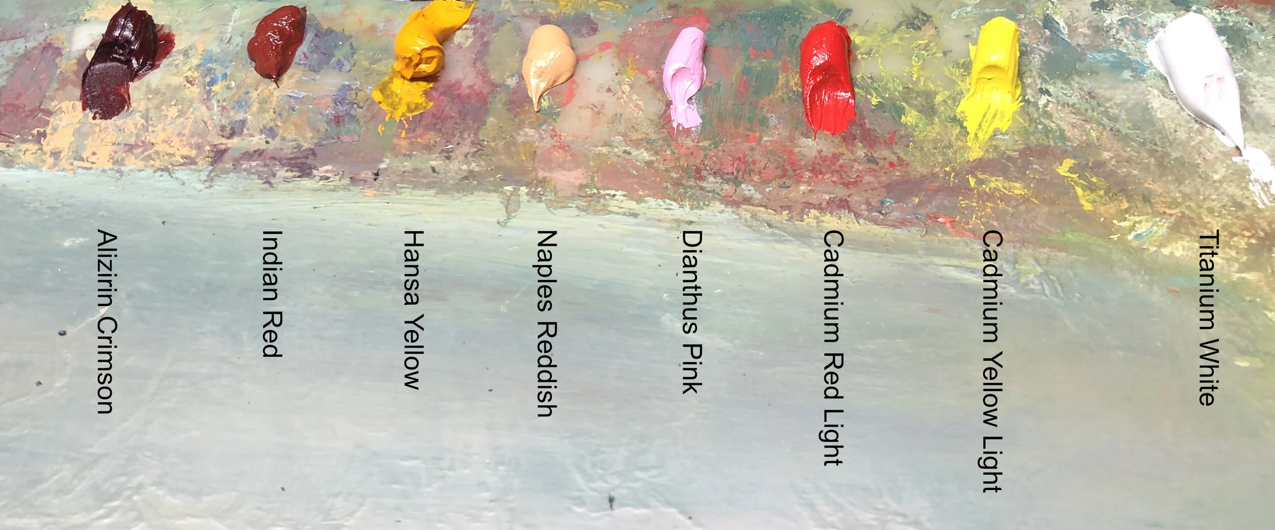
So today I thought I’d give you a peek at the pile of crayons I use and talk about my palette. I do mix things up here and there, experimenting when the mood suits me, but I would venture to say that it has changed little in the past forty years. I started out using a modern adaptation of “Pissaro’s palette” as do most art students, then expanded and detracted colors as I learned more about my needs. Though I expect there will be more changes down the road, at the moment I’m very happy and confident in my arsenal of dependable pigments.
I won’t bore you with a screed on each of them, but there are a few pigments to which I have developed a strong affinity. I love these favorites for their feel, versatility and sometimes even their smell, but most of all I need them for the way they work with others. One of them, in fact, isn’t even in the pictures above and that’s because I keep it separate and as clean as possible. That hue is Yellow Ochre, and I use it for underpainting and developing tonal planes at the outset of a picture. It is an earth pigment, and very easily overpowered by other colors, hence it’s quarantine.
On the other hand, I love the power of Indigo. I use it often as the base of dark tones, albeit carefully as it is so strong. BUT, it’s not as powerful as the more commonly used Prussian or Cobalt Blues, both which seem to spread throughout a wet canvas like a fog. Indigo is, of course, an old pigment, traditionally extracted from the leaves of the Woad shrub. There is also a synthetic indigo, but it is not used in oil paint very often, but rather in the denim industry.
A relatively new addition to my palette is Hansa Yellow Deep. I am not ashamed to admit that I first picked it up at the RISD Store because I was out of Cadmium Yellow, but didn’t have the funds to replace it, so I tried Hansa Yellow Light instead. It ended up becoming much more than a cheap second fiddle though, as I found it more transparent and cooler. So much so that when I returned to Cadmium Yellow, I added the deeper Hansa in place of Indian yellow.
The last color I’ll highlight is Umber. Nowhere near an extrovert, it is one of the more humble colors in any palette. Probably the oldest known pigment to be used by human hands (like in the cave paintings of Altamira and Lasceaux), it is everywhere throughout the history of art. It’s name possibly derives from ombra, the Latin word for “shadow” and it is especially present in the work of the late Renaissance (check out the dark areas of the Rembrandt Self-portrait, shown above, for instance), where it was essential in the development of chiaroscuro.
As I said before, this box of crayons will most definitely change as my work (hopefully) progresses. Like any technology, pigment production is sure to continue and offer things we cannot even imagine possible. Just look at Vanta Black. Imagine where Rembrandt would have gone with THAT on his palette!


